Tutorial: forecast vs. realised load
How well did the day-ahead load forecast track reality for Belgium during the week of 2024-01-15 → 2024-01-22? This tutorial pulls two parallel series:
actual_total_load— Load 6.1.A,processType=A16("Realised").day_ahead_load_forecast— Load 6.1.B,processType=A01("Day ahead").
…lines them up, plots both on the same axes, and computes the mean absolute percentage error (MAP).
Setup
using ENTSOE
using CairoMakie
using Statistics: mean
using Dates

CairoMakie.activate!(type = "png")

include(joinpath(pkgdir(ENTSOE), "test", "_brokenrecord_helpers.jl"))
const BR = _load_brokenrecord()
client = ENTSOEClient("PLAYBACK")
Two parallel series
Both wrappers have the same shape — same area code, same period arguments, same (time, value) StructVector return — so we can hit them back-to-back. Realised load first:
actual = BR.playback("tut_load_actual_BE_week.yml") do
    actual_total_load(
        client, EIC.BE,
        DateTime("2024-01-14T23:00"),
        DateTime("2024-01-21T23:00"))
end
length(actual), actual[1], actual[end]
(672, (time = Dates.DateTime("2024-01-14T23:00:00"), value = 9728.1), (time = Dates.DateTime("2024-01-21T22:45:00"), value = 9128.59))…and the day-ahead forecast for the same window:
forecast = BR.playback("tut_load_forecast_BE_week.yml") do
    day_ahead_load_forecast(
        client, EIC.BE,
        DateTime("2024-01-14T23:00"),
        DateTime("2024-01-21T23:00"))
end
length(forecast), forecast[1]
(672, (time = Dates.DateTime("2024-01-14T23:00:00"), value = 9317.99))Both series come back at the same quarter-hour resolution, so we can compute the error directly with column-view subtraction:
@assert length(actual.value) == length(forecast.value) == length(actual.time)

err  = forecast.value .- actual.value           # MW, signed
ape  = abs.(err) ./ actual.value .* 100         # absolute % error per slot
map = sum(ape) / length(ape)                   # mean absolute % error
bias = sum(err) / sum(actual.value) * 100       # signed bias as a %

(map_pct = round(map; digits = 2),
 bias_pct = round(bias; digits = 2),
 worst_slot_idx = argmax(ape),
 worst_pct = round(maximum(ape); digits = 2))
(map_pct = 2.33, bias_pct = -1.12, worst_slot_idx = 531, worst_pct = 9.92)A MAP around 2 % is solid for a system-wide load forecast; the signed bias tells us whether the forecast over- or under-shoots on average.
Plotting
fig = Figure(size = (900, 520))

ax1 = Axis(fig[1, 1];
    ylabel = "GW",
    title  = "BE load — actual vs. day-ahead forecast (week 2024-01-15)",
)
xs = 1:length(actual.value)
lines!(ax1, xs, actual.value ./ 1_000;
    color = :black, linewidth = 1.4, label = "Realised")
lines!(ax1, xs, forecast.value ./ 1_000;
    color = :firebrick, linewidth = 1.4, linestyle = :dash,
    label = "Day-ahead forecast")
axislegend(ax1; position = :rb, framevisible = false)

ax2 = Axis(fig[2, 1];
    ylabel = "Forecast − actual (MW)",
    xlabel = "UTC time",
)
hlines!(ax2, [0]; color = :gray70, linewidth = 0.5)
# `band!` accepts a single fill colour, so we draw the over- and under-
# forecast halves as two bands. Clamping to zero keeps each half on its
# correct side of the axis.
band!(ax2, xs, zeros(length(err)), max.(err, 0);
    color = (:firebrick, 0.35), label = "Over-forecast")
band!(ax2, xs, min.(err, 0), zeros(length(err));
    color = (:seagreen,  0.35), label = "Under-forecast")
lines!(ax2, xs, err; color = :black, linewidth = 0.6)

linkxaxes!(ax1, ax2)
ax2.xticks = (
    1:96:length(err),    # one tick per day (96 quarter-hours)
    [Dates.format(actual.time[i], "E dd") for i in 1:96:length(err)],
)
hidexdecorations!(ax1; grid = false)
rowgap!(fig.layout, 1, 6)
fig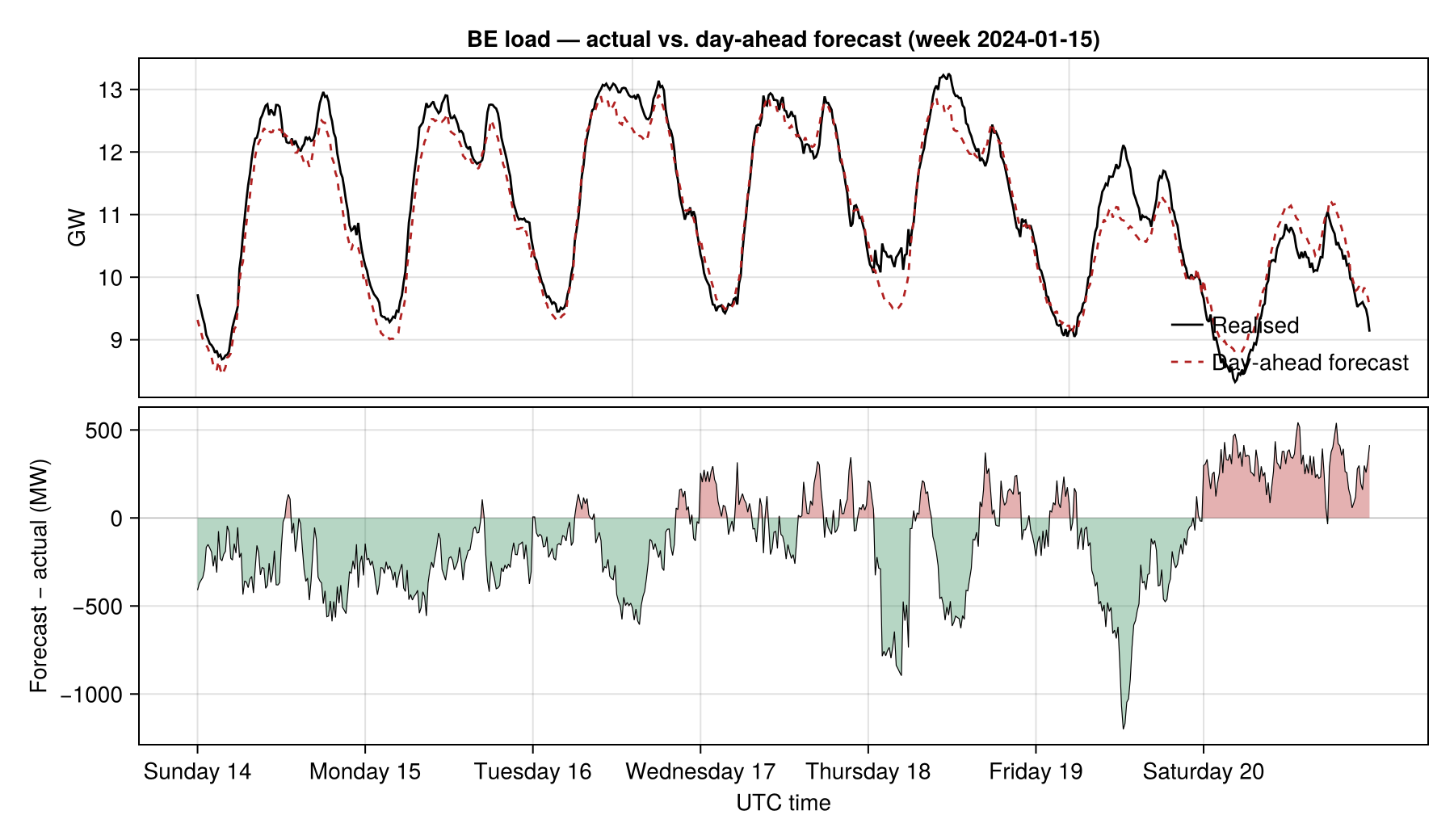
A second plot — the error histogram — gives a quick read on the forecast's shape (centred? skewed? heavy-tailed?):
fig2 = Figure(size = (720, 320))
ax = Axis(fig2[1, 1];
    xlabel = "Forecast − actual (MW)",
    ylabel = "count",
    title  = "Error distribution — week of 2024-01-15",
)
hist!(ax, err; bins = 40, color = (:steelblue, 0.7), strokewidth = 0.5,
    strokecolor = :white)
vlines!(ax, [0.0]; color = :black, linestyle = :dash, linewidth = 0.8)
fig2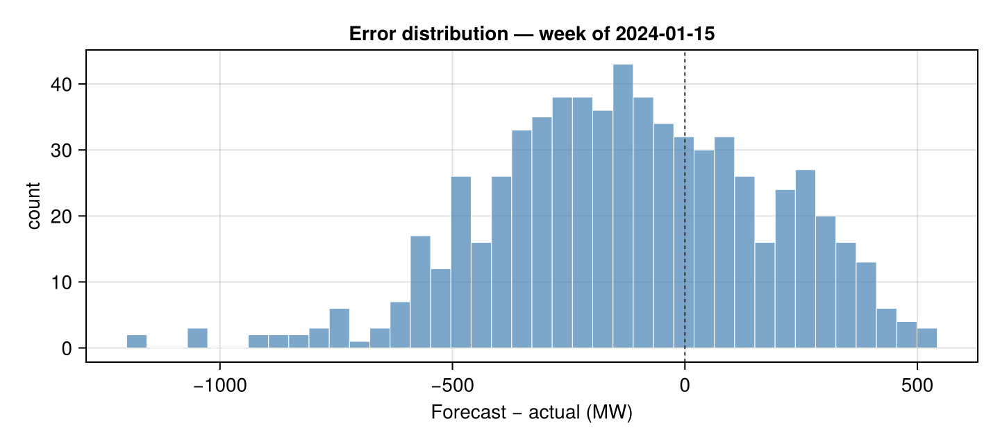
What you read from this:
Daily diurnal pattern is captured well by the forecast — the morning ramp and evening shoulder track within a few hundred MW.
Errors cluster at the peaks, where small percentage errors translate to bigger MW gaps.
The signed-error band in the bottom panel shows where the forecast leans too high (red) versus too low (green).
Where to next
For longer horizons, the same pattern works with
week_ahead_load_forecast(Load 6.1.C),month_ahead_load_forecast(6.1.D), andyear_ahead_load_forecast(6.1.E).For the generation side of the forecast accuracy story, see
generation_forecast_day_aheadandwind_solar_forecast.For full-history accuracy work spanning multiple years, just call the wrapper over the long range — it splits into yearly windows automatically. See the multi-year tutorial.